
LEE SISSOM
LEE SISSOM
COLORADO STATE UNIVERSITY COLLEGE OF BUSINESS
PROMOTIONAL ITEMS


Every fall, the College of Business at Colorado State University holds a Ram Welcome event for incoming Freshmen. They attempt to set the tone for the next four years, hiring caterers and live musical performers as the students get acquainted with campus. For the 2025 school year, I worked with a team of other designers at the College to create 15 designs for the Dean and shareholders to choose from. Working with the CSU Find Your Energy brand guidelines, the task was to create an eye-catching design that included some of the key visual elements associated with CSU to serve as a visual introduction and keepsake for the newcomers. In my designs, the focus became incorporating ram horn motifs, incorporating mountain imagery, and including recognizable geographic features like Horsetooth Reservoir. The design shown on the model was the finalist from my set of designs, and the others were some of our favorite contenders.


Other promotional materials I worked on during my time at the College of Business were Cam the Ram cardboard cutouts for networking events. We also made custom cookies for commencement, worked on creating flyer templates, and made materials for alumni including football tailgating passes.
Allicar Museum of Art
EXHIBITION DESIGN


The Allicar Museum of Art challenged me and a group of my peers to create a fully fledged exhibition concept. They had us create full maps of the gallery, lists of items that would be in the collection, as well as create a brand through museum-specific materials such as object plaques. As the graphic designer of the group, I learned how to handle museum artifacts, photograph them, and created a brand based off of those works. The logo’s cow motif pulls from the Allicar’s connections to Andy Worhol and references our concept, ‘Animals as Symbolic Representation Throughout Global Art History’. One of the most recognizable aspects of the Allicar is the Campbell’s Soup Can by Worhol. Instead of drawing on this directly, I challenged myself to create a golden seal and typography reminiscent of Campbell’s branding, while incorporating another of Worhol’s works, ‘Cow’. This work was included in this exhibition specifically and made nice connections between the museum’s history and the artists featured in the collection.
ALLICAR MUSEUM OF ART
DESIGN WEEK


Colorado State University Design Week was an effort to emulate large design conferences by inviting some of the biggest names in design to speak at CSU. I had the honor of creating a kinetic system and brand guidelines for this event. For my inspiration, I decided that the Design Week would take place at the Allicar Museum of Art. Since Spring is generally the time of year that the Trial Gardens take place outside of the museum, I came up with the theme ‘Trial & Error’ to encapsulate the essence of being a designer — constantly experimenting with visual solutions. The brand drew heavily on images of flowers. Other notable touches are the textures within the brand guidelines, created with the overlay of a burlap sack to reference the Gardens while adding texture and visual intrigue.

MODULAR TYPEFACE
Hallow is a modular typeface inspired by the fall season. The forms of the letters draw heavily on gothic manuscripts. However, to give a more spooky feel, the ornaments on the letters are filled by cobwebs and the curved components many letters draw on the shape of bat wings. Many of the forms of the letters themselves are also unfilled and supported by stringy filaments that are also supposed to emulate the form of cobwebs. This typeface, while initially intended as a Halloween font, has many applications. The webbed elements can easily be filled for other applications.
COLORADO STATE UNIVERSITY AGRICULTURE INITIATIVE
REBRAND
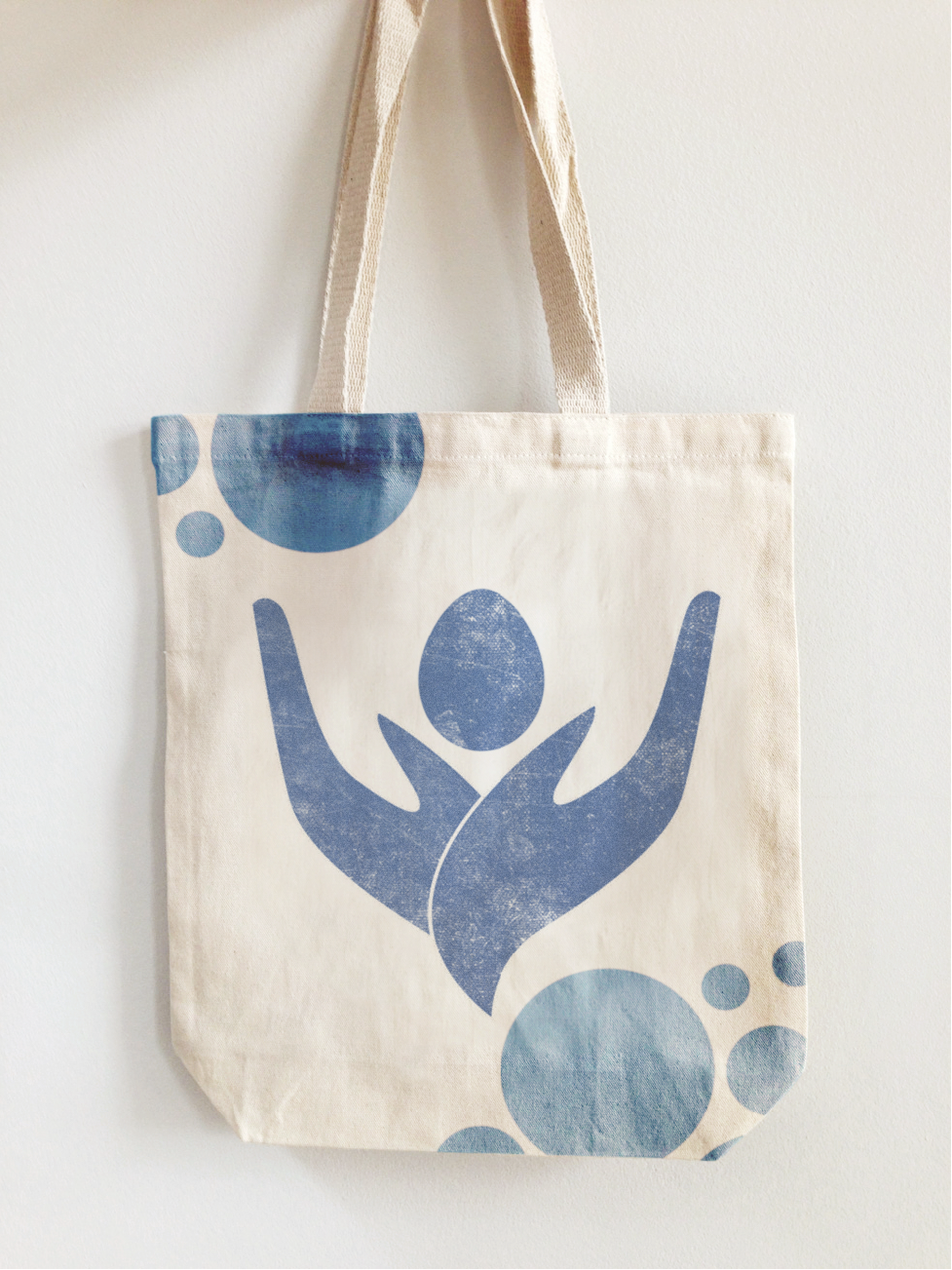

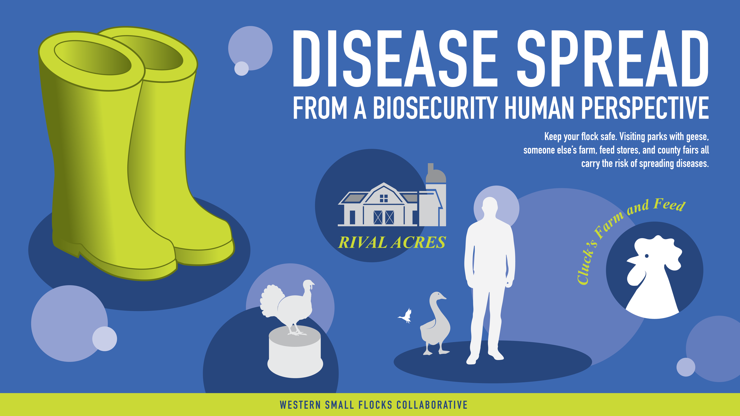
The Western Small Flock Collaboration recruited us to rebrand their website while the growing issues with Bird Flu skyrocketed egg prices. Their goal was to ‘create a comprehensive and accessible educational resource toolkit for small flock owners’. This also meant that we had to target consumers of all ages, as they predicted that the demographics pushing to own chickens were likely children who would need the assistance of adults in their lives to make their dreams come true. We wanted to make things have a professional and reputable, but still eye-catching feel. The circular patterns on many of our materials became a way to subtly reference the fact that many of the materials focused on disease prevention. This became a way to make our materials balance the seriousness of the topics being addressed while being palatable and enjoyable for kids.
LOGO DESIGN


Colorful, cold, and vibrant were the words that I used when thinking about the brand identity that I wanted to create for Vnukovo International Airport (VKO). While in Moscow the weather is usually cold and dreary, the citizens who inhabit it have shown resistance towards this life, generally having a propensity towards very bright and shocking colors within their architecture. For my brand identity, I wanted to pull on some of the more muted colors of the sky that I found in some reference images, as well as the colors of famous monuments, such as Saint Basil’s Cathedral. The logo itself was created as a result of playing around on a circular gridded paper, attempting to combine the letters in a way that was both true to the grid and maintained a strong sense of flow and movement. The secondary font, Panel Sans Bold, pays homage to the sloping roofs of Russian Decorative architecture. Additionally, the changing of the tittle over the letter ‘i’ referenced the distinctive color blocking created by the caps of these tent style churches.